Moxin
Explore, download, and run open-source Large Language Models locally
- Role
- Product Designer Product Strategy, Information Architecture, UX & UI Design, Prototyping
- When
- Feb 2024 - Aug 2024 (7 months)
- Team
- 1 Project Manager 6 Developers
TL;DR
01Project
Sole product designer on Moxin (now Moly) — a desktop app for running open-source LLMs locally.
02The challenge
Powerful but hard to use: too many models, no consistent interface, and no users yet to design from.
03What I did
Audited the competition, then designed model discovery and multi-model chat around a 3-area MVP scope.
Open-source LLMs
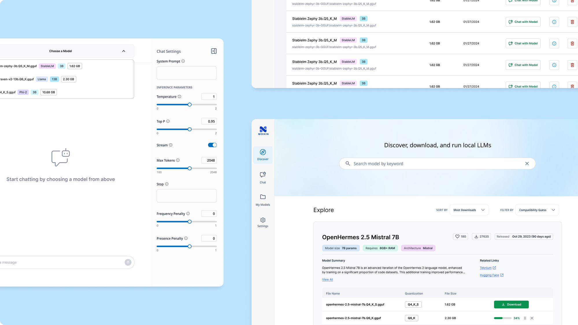
Moxin (now named Moly) lets people explore, download, and run open-source LLMs locally. It was also a flagship app for Project Robius — a Rust-advocacy initiative — so the product's success doubled as proof for the framework itself.
The problem
How might we design an intuitive platform that balances usability and flexibility, empowering more users to experiment with open-source LLMs?
Learning the landscape
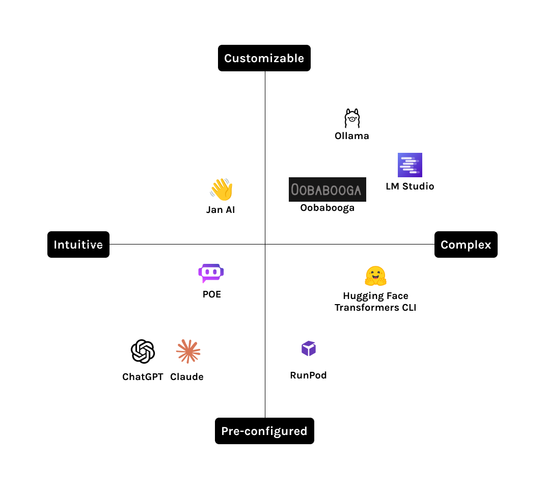
With no users of our own yet, I audited competing products and lurked in their communities — reading real discussions about what people valued, what frustrated them, and the patterns worth borrowing.
- Control vs. usability. Existing tools are either easy to use and restrictive, or flexible and complex — rarely both.
- Model overload. With 1M+ open-source models, first-time users can't tell which one fits their needs without guidance.
- Switching, not just choosing. People compare multiple models per task — the experience has to make switching as smooth as picking one.
Landscape
Scoping the MVP
From those findings, the team and I scoped three priority areas for the MVP, balancing what users needed against what was technically feasible.
- Guided model discovery. A curated, searchable dashboard for finding the right model with confidence.
- Multi-model chat. Switch models mid-conversation without losing your place.
- Intuitive customization. Adjust parameters like temperature and token limits without needing to know what they mean.
I mapped the information architecture, then ran a weekly cycle with developers — wireframes for alignment, then high-fidelity design, iterating on their feedback each round.
HomepageModel Discovery & SearchModel DownloadChatModel SelectionChat InterfaceModel SettingsMy ModelsModel ManagementView InfoChatDeleteSettingsGeneralAPI Keys
Designing model discovery
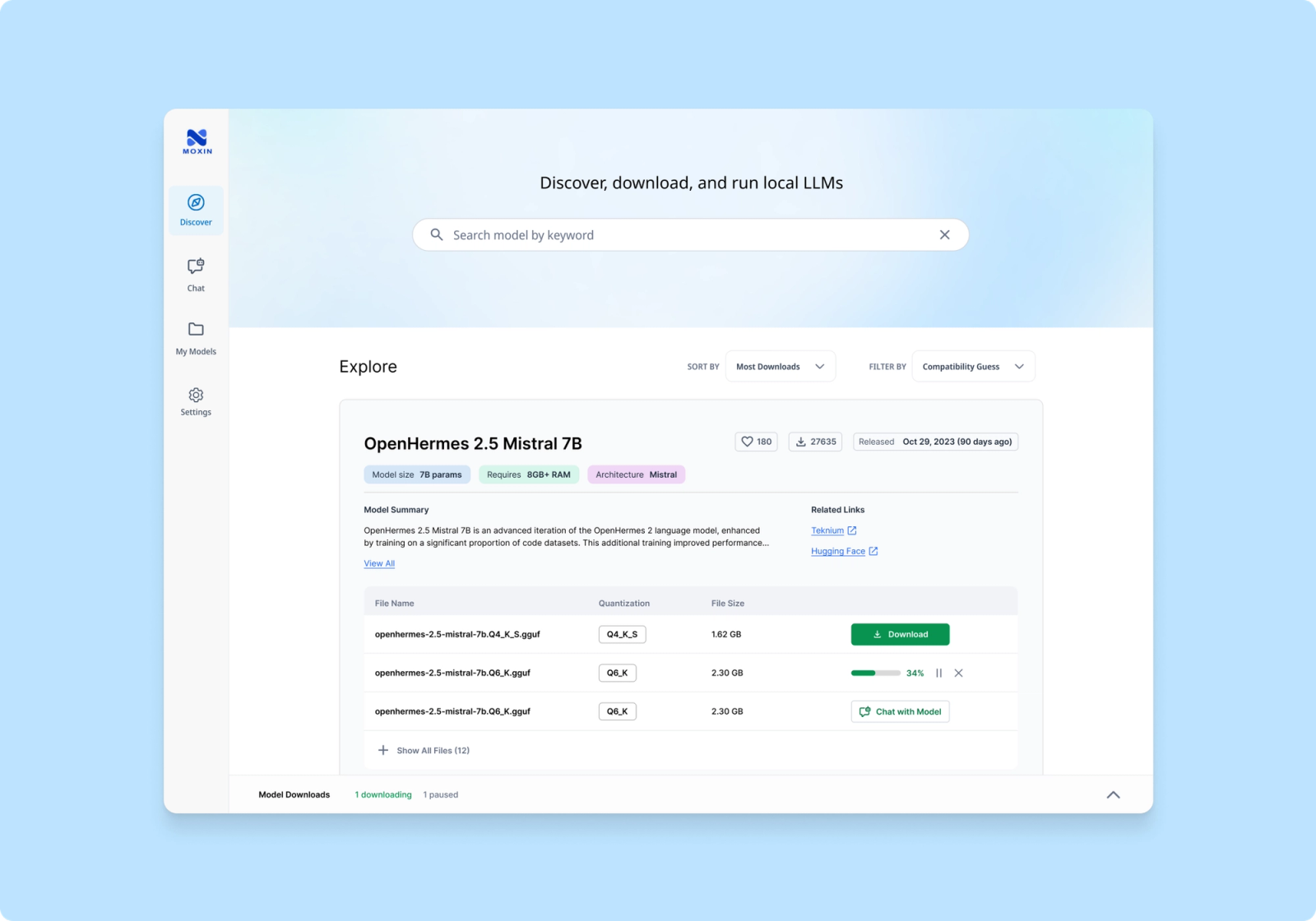
Browsing models Challenge. A single model's info card can carry 10+ versions and dense technical specs — enough to overwhelm a first-time user, even though every field matters for an informed choice.
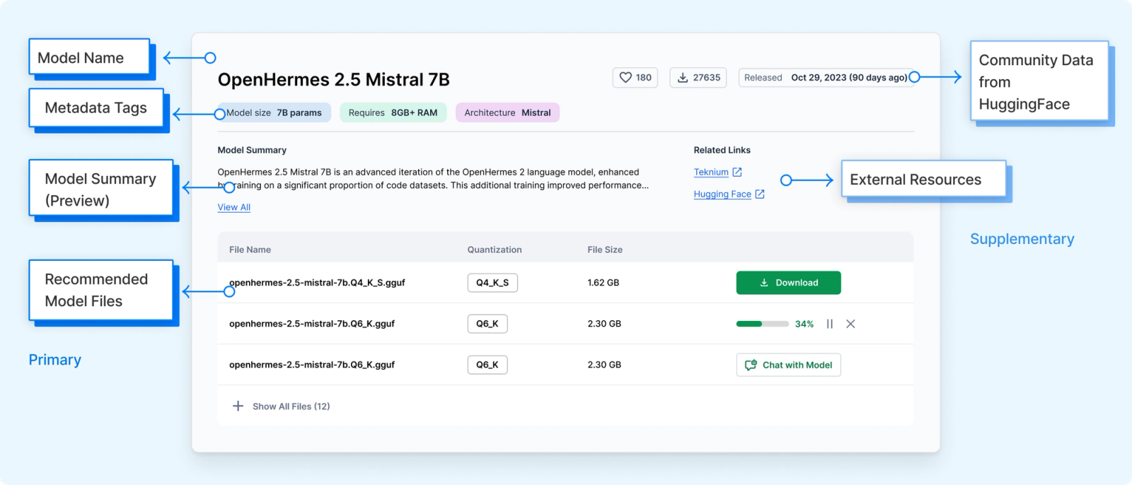
I interviewed developers on the team and ran a card-sort to find which data points actually drove their decisions, then split the experience in two: a glance view for quick fit, and a detail view for the technical deep-dive — so nobody has to parse everything at once.
Browse — at a glanceModel AModel BModel CModel card — full detailArchitectureBenchmarksResource needsVersions- Model Fit. Users need a quick way to see if a model is right for their use case.
- Community Indicators. Hugging Face likes and download counts offer valuable social proof.
- Release Date. Developers want to know if a model is current.
- Technical Details. Architecture, summaries, documentation, and performance benchmarks help users compare models.
- Resource Requirements. Model size and RAM needs determine whether it'll actually run.
Model card detail
Designing multi-model chat
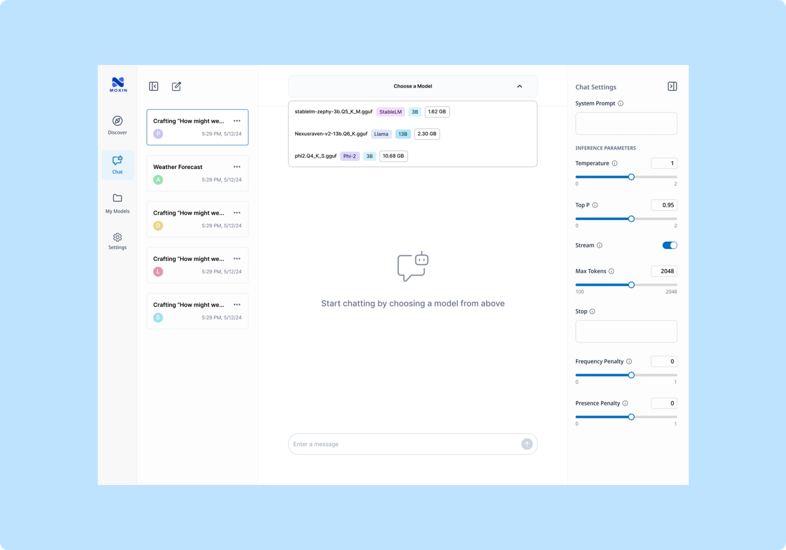
The multi-model chat interface 04Design Solution #2: Multi-Model Chat
Challenge. Moxin lets people switch models mid-conversation, and different chats can point to different models — flexible, but easy to lose track of which model you're actually talking to. The goal: make that always obvious.
Key design decision #1
Visual Cues for Quick Model Recognition — Avatars for Models
Avatars for models. Long, hard-to-memorize model names get replaced with a color-coded avatar and initial — a quick visual cue for which model you're talking to.
What I traded away
Tooltips for detail. A single letter isn't always enough — hovering the avatar reveals the full model name, without cluttering the interface.
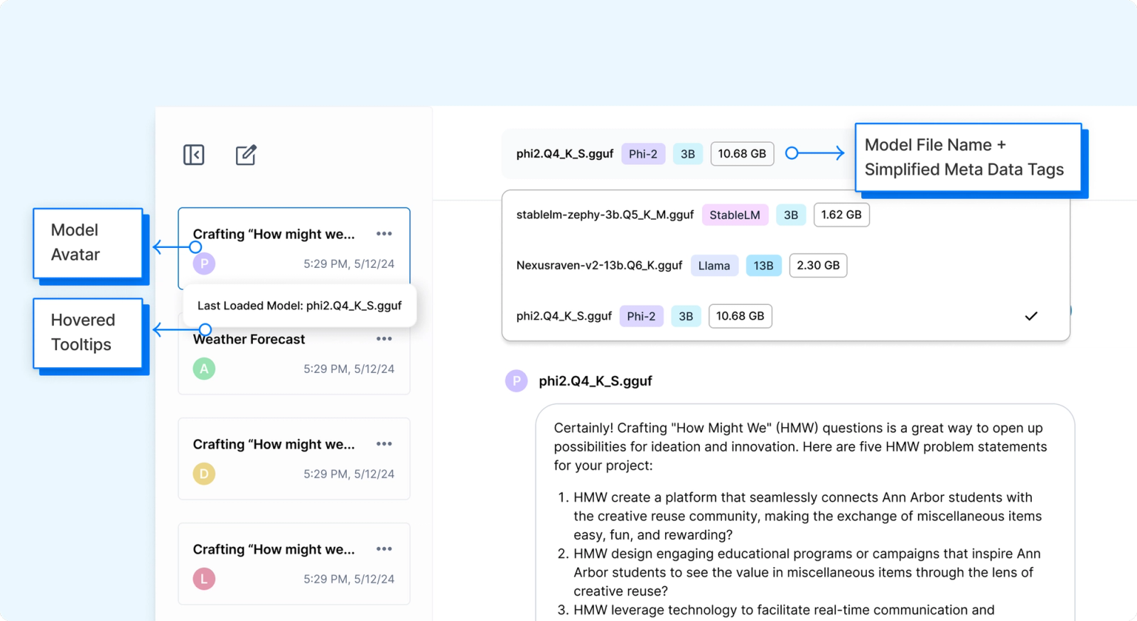
The model-name tooltip on hover Key design decision #2
Clarifying User Intentions & Communicating System Processes
Stay or start fresh. Switching models mid-chat surfaces both choices in a pop-up, so people choose their workflow and always know when a switch happened.
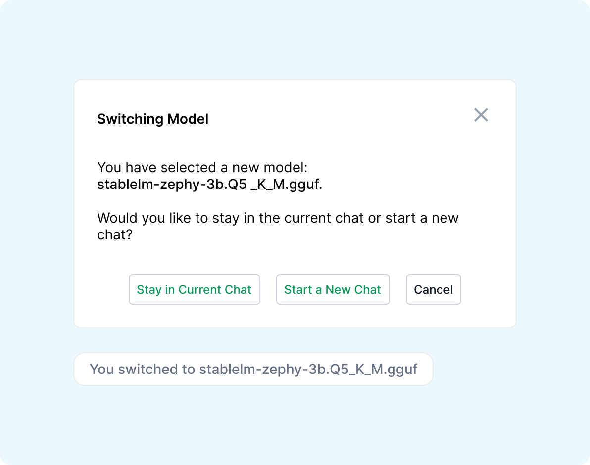
The model-switch confirmation pop-up
Lessons Learned
Understanding the Technical Context of a Niche Product
Steep learning curve. I couldn't parse the open-source LLM interface when I joined — designing it meant learning the technical concepts fast enough to collaborate with developers as a peer, not just a designer handing off screens.
The Importance of Prioritizing and Scoping Down for an MVP
Scope ruthlessly. Countless features were possible; only a few were essential for launch. Getting those right mattered more than covering everything.
Adapting to Technical Constraints
Design within real constraints. The framework was still maturing and couldn't support every idea — close collaboration with developers turned that into informed trade-offs, not compromises.